custom widgets
用意されているwidgetsでレイアウトできない場合は、自作のwidgetsを作成して使用することができます。
自作widgetsの作成手順を示します。
自作widgetsの仕様
- widgets名: [inputWithRemarks]
- 備考が指定できるinput
- remarksプロパティを指定しない場合は表示されない
| プロパティ | 内容 | 必須 | 国際化 | 備考 |
|---|---|---|---|---|
| type | widgetsの種別 | 必須 | inputWithRemarks | |
| key | Schemaの項目キー | 必須 | ||
| title | 項目名 | 必須 | 対象 | |
| remarks | 備考 | 対象 | ||
| flex | flex定義 | wrapper,section内のみ有効 |
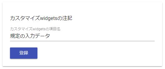
自作widgetsの完成イメージ
自作widgets使い方
コードサンプル:
import { SimpleComponent } from '../customize';

  combine = {
    widgets: {
      inputWithRemarks: SimpleComponent
    },
    schema: personSchema,
    layout: personLayout,
    master: defaultMaster,
    data: personData,
    message: null,
    page: {
      pageID: 'topPage'
    },
  };
入力データのwidgetsプロパティに[SimpleComponent]を設定します。 [inputWithRemarks]が、自作widgetsの名前になります。
レイアウトサンプル:
[
  {
    "type": "inputWithRemarks",
    "key": "simpleSchema",
    "title": "simpleSchema",
    "remarks": "simpleNote"
  }
]
[type]プロパティに自作widgets名を指定すれば、組込widgetsと同様に使用できます。
コード解説
simple.component.ts
import { Component, Input, Output, EventEmitter, OnInit } from '@angular/core';
import { FormGroup } from '@angular/forms';
import { JsfService } from '../../lib/';

@Component({
  selector: 'simple-widget',
  templateUrl: './simple.component.html',
  styleUrls: ['./simple.component.scss'],
  providers: [ JsfService ]
})
export class SimpleComponent implements OnInit {
  @Input() widgets = {};  // widgetリスト
  @Input() debug = false; // デバッグフラグ
  @Input() innerOption = null; // 内部オプション
  @Input() parentGroup: FormGroup;
  @Input() page: any;
  @Input() schema: any;
  @Input() master: any = null;
  @Input() data: any;
  @Input() option: any;
  @Input() direction = 'row';
  @Input() dimension = 0;
  @Input() index = 0;
  @Input() num = 0;
  @Input() shared: any;
  @Output() buttonClick: EventEmitter<any> = new EventEmitter();

  /** エラー情報取得エリア */
  formErrors = {};

  constructor(
    public jsf: JsfService
  ) {
  }

  ngOnInit() {
    this.parentGroup.valueChanges
      .subscribe(data => this.onValueChanged(data));
  }

  /**
  * モデル変更時のエラーチェック
  * @param event
  */
  onValueChanged(event: any) {
    this.jsf.checkError(this.parentGroup, this.option, this.dimension, this.formErrors, this.page.pageID, null, false);
  }

  /**
  * フォーカスアウト時のエラーチェック
  * @param key
  */
  focusOutFunction(key: any) {
    this.jsf.checkError(this.parentGroup, this.option, this.dimension, this.formErrors, this.page.pageID, key, true);
  }

}
| プロパティ | 内容 | 必須 | 備考 |
|---|---|---|---|
| widgets | カスタムwidgets | ||
| debug | デバッグモード | trueの場合、必須項目のチェックを行う。 | |
| innerOption | 内部オプション | widgets間連携などで使用 | |
| parentGroup | FormGroupのインスタンス | ||
| page | ページ定義 | 必須 | |
| schema | JSON Schema | 必須 | |
| master | ページ定義 | 必須 | |
| data | 規定値 | 必須 | |
| option | レイアウトで定義されたプロパティ | 必須 | |
| direction | レイアウトの方向 | 必須 | row / column (現在は未サポート) |
| dimension | Array要素の次元数 | ||
| index | Array要素の規定値の処理項目番号 | ||
| num | Array要素の項目数 | ||
| shared | Widgets間共有データ | ||
| buttonClick | ボタンクリック時のcallback関数 | @Output要素 |
optionには、レイアウトのプロパティ値が要素名として取得できます。 option.keyは、JSON Schemaの項目に値を設定する場合は、必須項目です。 それ以外は、プロパティ名を自由に設定することができます。 今回の自作Widgetsでは、option.remarksが[備考]を指定するプロパティとなります。
※入力値を参照するコード:
let currentValue = this.parentGroup.properties[this.option.key].value
※選択要素の状態で表示を切り替えたい場合は、[dispCondition]プロパティを使用します。
<div *ngIf="option.dispCondition === undefined || jsf.viewCondition(parentGroup, option)">
  ここで条件にあった場合の表示処理を行う
</div>
simple.component.html
<div [formGroup]="parentGroup">
  <mat-form-field class="full-width">
    <input matInput placeholder="{{ option.title | mk_ng2_i18n: page.pageID }}" [formControlName]="option.key"/>
    <mat-error>{{ formErrors[option.key] }}</mat-error>
  </mat-form-field>
  <div *ngIf="option.remarks !== undefined">{{ option.remarks | mk_ng2_i18n: page.pageID }}</div>
</div>
[option.title]、[option.remarks]は文字要素なので、必ず、mk_ng2_i18nパイプで国際化対応を行います。 また、*ngIfで[option.remarks]の存在をチェックして処理することで、指定した時だけ備考を表示します。
simple.component.scss
inputの入力エリアを画面幅にするためのスタイル設定例:
.full-width {
  width: 100%;
}
スタイルは自由に設定することができます。 Angular Material要素をデザインする場合は、Angular Materialの仕様を参照してください。